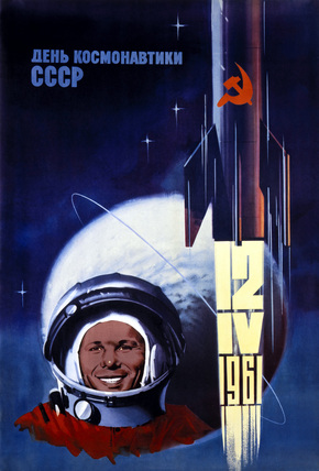
Russian space and graphic design
 The 5oth anniversary of Yuri Gagarin’s journey into space seemed like an appropriate time to talk about Russian graphic design
I’ve always liked the simplicity of Russian design. The heroics of the people, the sweeping blocks of colour and style.
I find it amazing that a society that was so isolated from western culture managed to produce graphic design that was so similar to that produced in the west. Of course it was different in terms of the subject matter, which couldn’t have been much further away from knocking out Coke and lifestyle products.
But it’s kind of like all graphic designers did the same course at the same college before going back to their respective states. The use of space, texture and typeface of Russian graphics all comply to the basic ‘rules’ of design. Those underpinning concepts of aesthetics that appealed to us in the west seemed to come as natural to those in the east too.
You couldn’t say the same about music.
Check out this poster, the colours, simple text and feeling of speed all point to ‘just enough’ and ‘just in the right place’. It’s awesome. Reckon I’ll be bring some Russian graphic style to the pages of this website over the next few months, Komrade.